Why Mobile-First Design Matters: Building User-Centric Experiences
In the dynamic world of web design, staying ahead of evolving user behaviors and technological shifts is key to crafting memorable and effective digital experiences. The concept of “Mobile-First Design” has emerged as a pivotal approach to address the growing dominance of mobile devices in online interactions. This approach prioritizes designing for mobile devices before considering the desktop experience, leading to improved user engagement, higher conversions, and a website that truly resonates with modern users.
Understanding Mobile-First Design:
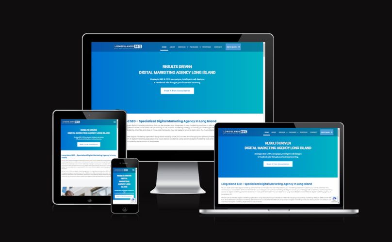
Mobile-First Design entails starting the design and development process by focusing on the mobile user experience and then progressively enhancing it for larger screens. It acknowledges the shift in user preferences towards mobile devices for accessing the web, and it aligns perfectly with the principles of responsive web design. In essence, a mobile-first approach recognizes that a substantial portion of website traffic originates from smartphones and tablets and strives to provide these users with a seamless, optimized experience.
The Significance of Mobile Traffic:
Mobile traffic has been consistently on the rise, with more users relying on their smartphones for online activities than ever before. Whether it’s browsing social media, shopping, reading content, or even conducting business transactions, mobile devices have become the go-to platform for accessing the internet. Ignoring this trend can lead to missed opportunities and dissatisfied users who expect websites to be fast, intuitive, and visually appealing on their mobile screens.
Impact on User Experience:
- Speed and Performance: Mobile-first design compels designers to prioritize performance optimization, resulting in faster loading times and a smoother user experience. This is crucial as mobile users are often on-the-go and have little patience for slow-loading pages.
- User-Centric Interfaces: Crafting interfaces for smaller screens encourages simplicity and efficiency. Designers are compelled to focus on the most essential elements and content, leading to cleaner layouts and better navigation.
- Content Hierarchy: Prioritizing mobile design forces content creators to distill information to its essence, making the content more engaging and digestible for users. This content hierarchy can then be extended to the desktop version.
- Conversion Rates: An intuitive and frictionless mobile experience contributes to improved conversion rates. Users are more likely to engage with your website’s calls-to-action and complete desired actions.
Long Island SEO’s Expertise in Mobile-First Design:
At Long Island SEO, we recognize that mobile-first design isn’t just a trend; it’s a fundamental shift in how websites should be crafted. Our expert web designers and developers understand the nuances of designing for mobile devices while ensuring a seamless transition to larger screens. Here’s how we can help:
- Strategic Approach: We begin by analyzing your target audience and their mobile usage patterns, allowing us to tailor a design strategy that speaks to their needs.
- Responsive Excellence: Our team excels in creating responsive designs that adapt flawlessly across various devices, guaranteeing a consistent and engaging experience for all users.
- Optimized Performance: We prioritize speed and performance, implementing techniques such as optimized images, efficient code, and caching to ensure swift loading times on mobile devices.
- Intuitive Navigation: Our mobile-first approach ensures that navigation is user-friendly and intuitive, helping visitors find what they need quickly and effortlessly.
- Conversion-Centric Design: We design with conversions in mind, strategically placing elements that drive user actions and enhance your business goals.
Embrace the Mobile-First Future with Long Island SEO:
In a time when most people use mobile phones a lot, Mobile-First Design is really important. It’s not just an idea about how things look; it’s something you really need to do to make sure people have a great time using your website. Long Island SEO can help you with this. We’ll make websites that work great on mobile phones and also on bigger screens. If you want your business to do well on mobile phones, contact us today.